Yokohama vs Fukuoka Part I
When I went to the Tokyo Art Fair in 2013, people told me that the art fair was disappointing but the one in Yokohama would be much better. I went to the Yokohama Triennale and I was incredibly disappointed. I planned on writing a scathing review but put it off since I was too busy to really think about what I wanted to say. In the mean time, Japanese friends and their friends were posting positive reviews. Tokyo Art Beat‘s Nick West did a fantastic job of covering some of the positive points and logistics. What did they see that I didn’t? Did I just have a bad day? Were art fairs overly inflated events just like Eric Fischl wrote in the New Yorker? Then I went to the 5th Fukuoka Asian Triennale (FT5). It was fabulous! What happened? What was so different?
 When I went to Yokohama, the first piece of artwork I saw was Gimhongsok’s teddy bear made of garbage bags in the train station. This same bear was used on promotional material in the same way that kawaii cartoon characters are used as mascots throughout Japan.
  It reminded me of things that students make for school festivals here in Japan. The bear was well made but was it really the first thing you want people to see at a supposedly international art festival? Not really. Some of the organizers must have had the same thought. The bear had been leaning against a pole and was easy to miss. Its visual impact was very low. As I walked along, I soon saw a monochromatic, geometric sculpture but soon forgot it.
 A large, rusty semi truck and flatbed trailer (2007) made by Wim Delvoye was parked in front of the main venue; lacy patterns had been etched into it. That should catch people’s attention but
  more people were playing with the mist machines that had been installed to cool people on hot days but were still working on the rainy day that I went. I remember seeing Cal Lane‘s 5 Shovels (2005) and being amazed. Here I was seeing the same basic thing but on a larger scale. I felt like the idea had been recycled. Just wait! I chose that word on purpose and it will make more sense as I continue. A much smaller sculpture of blue rubber balloons stacked one upon the other was beside the truck and also in another location.
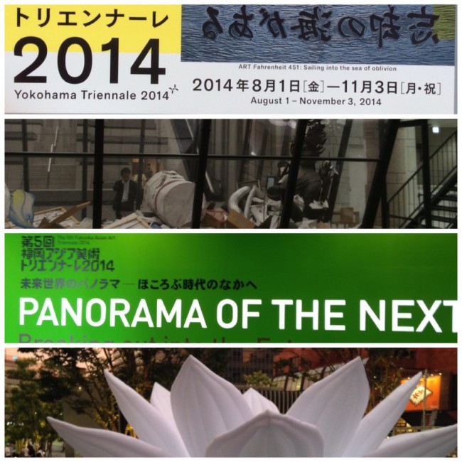
 As I got closer, I noticed that the sign for the Yokohama Triennale was all in Japanese and reversed to make it even more difficult to read. How on earth was this supposed to be an international art fair when no attempt was made to communicate with international visitors? What did Fahrenheit 451 have to do with garbage-bag teddy bears, rubber balloons, or a rusty truck? Not impressed. If the theme had been the three R’s of Reduce, Reuse, Recycle, then maybe. Things went downhill from there.
If I had known that the artistic director was Yasumasa Morimura, who is famed for dressing up in costumes and photographing himself in replicas of famous photos or paintings such as the Mona Lisa, I would have been more hesitant to go from the start. Why? His photos might be fun but they are basically gags, things that are commonly done in advertising. Yes, Cindy Sherman also dresses up in wigs, prosthetics, make-up, and costumes but she usually make original characters. He does not. Is it art just because he dresses in drag? I do not think so.
 I was there on that day at that time to see my friend Deanna participate in one of the scheduled activities. She and many others sent in applications with photographs of their work, so they could throw some of their artwork into the Art Bin by Michael Landy. In the Tokyo area, people almost always have to apply to attend an art-related activity or lecture even if it is free. The implication is that many people want to participate and only the lucky can go, right? Wrong. She was the only one there.
Two white girls walk into an art fair on a rainy day with volunteer guides lined up waiting for something to do, and of course somebody will approach us with poor English skills. Yes, that sounds harsh and it is meant to be, because this elderly guide, although very sweet and well intentioned, was a poor guide, poorly trained, or both. We gave him a chance and followed him for a short while since we had to find out where Deanna was supposed to meet the organizers. Our supposed guide then started talking about the Art Bin, focusing on the work inside it by one one of the Japanese artists and never mentioned Michael Landy! He just ignored the main artist of the largest piece in the gallery’s lobby! If he had started with Michael Landy and then added a factoid about the japanese artist, his information would have been interesting but instead he gave off the impression that he and perhaps the entire show was Japan-centric and poorly organized.
 Deanna’s Art Bin adventures are another good example. One of the gallery’s staff members eventually found us and asked my friend to sign a waiver before the start. She explained that Deanna was supposed to climb the stairs and then throw her artwork into the bin from the platform. and then the gallery representative left. There were no other artists needing to sign waivers. Only Deanna.
 This was an official gallery-sanctioned event, so I waited for other artists or staff to arrive. I expected
  some fanfare or at least an announcement that somebody was adding something to the Art Bin. I thought Deanna was just going to check out the platform and plan what she was going to do when all of a sudden she threw her crocheted spider into the bin! What? I had to quickly snap a few pictures as best as I could to record the moment for her. The lonely sound of one person clapping could be heard. The ceremony was over before it even started!

 The art in the bin was being recycled in this way rather than being thrown to the curb for pick-up on garbage day; the idea for having the bin in Yokohama was also recycled. Landy’s Art Bin had previously been shown in London to great success. People lined up to throw things into the bin. This was just a rerun in a feeble attempt to capitalize on the popularity achieved at an earlier art fair, and as with most reruns, fewer viewers showed up to see it in its second run.
We followed the outlined path, past the docent, and up the stairs. A few sculptures were placed along the stairs, and they seemed eye-catching although some were simply following the trend of making common items or creatures larger than in real life. At this stage we were still unaware that the show was supposedly being set up like a book in chapters ala Fahrenheit 451. Even now it still does not make much sense to me. Ray Bradbury’s book was about the suppression of ideas and the burning of books. Where did the curator’s get the subtitle, “Sailing into the Sea of Oblivion”? Bradbury’s novel was divided into three parts: The Hearth and the Salamander, The Sieve and the Sand, and Burning Brightly. How did Yokohama get two introductions and eleven chapters?
Introduction
Unmonumental Monuments
Wim Delvoye; GimhongsokWhat Is in the Center of the World?
Michael LandyChapter 1: Listening to Silence and Whispers
Kazimir Malevich; John Cage; Stanley Brown;Ian Wilson; Josh Smith; Agnes Martin; Karmelo Bermejo; Blinky Palermo; René Magritte; Marcel Broodthaers; Kimura Hiroshi*; Vija Celmins; Isa Genzken; Felix Gonzalez-Torres; Murakami Tomoharu*Chapter 2: Encountering a Drifting Classroom
Kama Gei (Kamasaki Art University)Chapter 3: ART Fahrenheit 451 [sic]
Taryn Simon; Moe Nai Ko To Ba (Watanabe Kazuo*, Ohie Toshio*, Shiga Lieko*, and others); Dora García; Michael Rakowitz; Edward & Nancy Reddin Kienholz; Otani Yoshihisa* collection; Matsumoto Shunsuke*; Narahara Ikko*; Eric Baudelaire;Chapter 4: Laboring in Solitude, Wrestling with the World
Fukuoka Michio*; Nakahira Takuma*; Zhang Enli; Mohri Yuko*; Alighiero Boetti*; Simon Starling; Yoshimura Masunobu*; Wada Masahiro*Chapter 5: Impersonal Chronicles
Temporary FoundationChapter 6: Monologues by Enfants Terribles
Joseph Cornell; Sakagami Chiyuki*; Matsui Chie*;Pierre Molinier; Alina Szapocznikow; Andy Warhol; Gregor SchneiderChapter 7: Vanishing into the Light
Mishima Anju*; Mishima Ritsue*Chapter 8: A Drifting Journey/ A Sea Reflecting Fleeting Images
Takayama Akira*; Toyoda Hitoshi*Chapter 9: Performing “Fahrenheit 451″
Sapporo International Art Festival 2014 – Various artistsChapter 10: Days After Deluge
Fukuoka Asian Art Triennale – Various artistsChapter 11: Drifting in a Sea of Oblivion
Yanagi Miwa*; Tsuchida Hiromi*; Melvin Moti; Akram Zaatari; Ana Mendieta; Bas Jan Ader; Jack Goldstein; Tonoshiki Tadashi*; Danh Vo; Kasai Erika*; Kasahara Emiko*; Elias Hansen; Kim Yongik; Matsuzawa Yutaka*; Ohtake Shinro*; Hino Naohiko**The organizers decided to publish Japanese artists with their family names first which is common in Japanese but unusual when Japanese names are written in English documents.

Even a book should be cohesive with the individual units or chapters bound together by some thought or theme. It quickly became obvious that the theme the organizers had in mind and the themes we were seeing were very different. Don’t even get me started on the mishmash of styles used to list the names of the artists or organizations involved in neither alphabetical order or in the Japanese phonetic order. Why was art the only one word to be printed in all capital letters and why was it added to the title of Ray Bradbury’s novel? I think the organizers themselves could not settle on only one theme, and this was obvious as you walked through disconnected collections of art. When explaining the title and concept of the show, the artistic director jumps from talking about the exploration of the sea of ‘oblivion’ by means of a ship called ‘art’ to the plot and theme of Ray Bradbury’s novel, Fahrenheit 451, without mentioning why they chose to add ‘art’ to the book’s title. In his own message, he cannot make up his mind regarding the title to his essay and decides on two titles side by side: The Conscience of Art/Art of the Unknown. And he uses a ship as a metaphor in that message to underline the fact that Yokohama is a port city. Did the department of tourism tell him to mention that fact? His message is directed at the gallery staff and includes his CV. He obviously did not consider the people who would be paying money to go to the show and did not explain to gallery goers why they made the decisions they did. If they had focused on journeys of the mind, ports as entry zones, or Bradbury’s novel or chosen another theme such as the Raft of the Medusa with its sense of sailing into disaster, the Yokohama Triennale would have been much more cohesive.
Regardless of what was written in the promotional material, several themes did emerge but they were not the ones that the organizers planned. The 3 R’s of Reduce, Reuse, Recycle that form the mantra for any environmentalist seemed to be the obvious theme at first with the garbage-bag bear and other items. Lots of artwork and shows soon after the earthquake, tsunami, and nuclear disasters of March 11, 2011 were dark, depressing, and expressed impending doom; the planning for this show started in such a climate so somebody felt the need to mention ‘the sea of oblivion’. Nationalism also increased afterwards, and the predominantly Japanese signage and order of names reflected that mood. Another type of recycling was the use of big names from the past.
Have Magritte, Cornell, or Warhol been featured in any other large art fair in the past decade? It reminded me of a conversation I had with a friend who used to work at a radio station. She said that much of the on-air talent had little experience as DJs and they tended to play their personal favourites, including obscure B-sides, instead of playing what the audiences wanted to hear. This makes sense if you stop to think that Morimusa rose to fame in the Eighties during Japan’s bubble economy when Japanese collectors, corporations, and galleries bought lots of artwork by big names in the art scene. It was a time of quantity over quality. John Cage’s blank sheet music for 4’33”, where the musician sits for the duration of the piece without making a sound, was framed and hanging on the wall without any other explanation. A series of grey lines by Agnes Martin was also on display without any fanfare. Four Magritte photographs where he was just goofing around with the camera were randomly given a place of honour. What kind of photos? Somebody walking behind a bush so it looked like their head was floating. That kind of thing. It was obviously taken as a personal favourite from the gallery’s permanent collection to flesh out the show. A huge dark room was filled with the sound of a man interviewing his cat. “Is this a pipe?” “Meow!” “This is not a pipe.” “Meow!” The only connection seemed to be the Magritte pieces, since Magritte made the famous painting of a pipe. Many minor works by major artists were scattered throughout the show.
 To be fair, a few pieces were memorable and occasionally a room (chapter) was cohesive, such as the photographs of survivors, the art book on the pedestal, the court yard and tennis court, and so on. The problem was that the gems were scarce.
  If the courtyard/tennis court, another oversized sculpture, had been in a different location, I think its effect would have been stronger. The two were separated and crammed into comparatively small spaces. I know that every artist would have liked to have been in the show at the main gallery, but these two would have dominated and might have been fabulous in the portside location. Some small, quiet pieces were grouped together at the very beginning and had very low impact despite their famed creators; others were crammed into the crowded gift shop and restaurant. Aside from the central area with the books and photographic portraits, it had the divisive feel of a group show or one featuring favourites from the gallery’s permanent collection. We did not leave this highly promoted show saying, “Wow!” We were left saying, “Why? Why did we spend so much money and so much time on this?” If the pieces within the gallery had been better curated or even positioned in a way that the viewer went on a visual journey, the entire show would have been better.
 On the other hand, the offsite areas seemed more cohesive and impressed us more. After being herded along the recommended course in the main gallery, it was nice to be near the open water.
  The location was lovely, and a scenic place to stop for lunch below a large mobile. Even with that in mind, the FT5 portion in Yokohama’s Shinko Pier exhibition hall seemed to have absorbed the dark, gloominess of the Yokohama show. The FT5 pieces probably would have been more at home at the more vibrant art museum in Fukuoka. Miwa Yanagi’s flatbed truck that resembled some of the flashy trucks driven in Japan was popular and opened up into a stage for performances. The details of the stage and the surrounding skirts were amazing! With all the doom and gloom on a dreary day, it was nice to see something with colour and humour, Even Godzilla made an appearance.


Although we enjoyed a few pieces at the pier location, we were glad to leave its mostly doom-and-gloom atmosphere for the more  cheerful BankART Studio NYK. FRom the moment we saw the window frames forming a corridor, we knew that we were finally going to see
  something unexpected. The building’s windows were also filled with little surprises, and the lot also had a few entertaining objects. windows As we entered, we encountered a visiting curator from Indonesia. She seemed to have enjoyed the exhibits at the main gallery more than we did but had lost her ticket for this offsite show along the way. She did not speak Japanese, so we explained her situation to the staff. She gave them one of her business cards, and they kindly accepted her word and let her enter. This gallery was much friendlier and warmer!

BankART Studio used the triennale as a chance to have an open house for their gallery. They featured a variety of artists in various media. Performances were also scheduled. Their bookstore also had sculptural pieces, but these pieces were much larger and less formal than the glass pieces in the main gallery’s gift shop. Everything seemed fresher here, not recycled or dated. The air near the pool filled with oil was not so fresh, but I digress. The wolves looked both like wolf pelts from a distance and like groups of wolves. Humour was evident in many pieces, and so was the fun in making and experiencing them. Japanese artists were featured but without the underlying nationalism of the main part of the triennale.


So why were curators so impressed with the Yokohama Triennale but we were not? From reading the comments of friends who run galleries, I think they focused on individual pieces, such as the decorated flat-bed truck, and the logistics involved in organizing a large event at several locations throughout a city. They were also entranced by the romance that they associated with Yokohama and its red-brick buildings. They did not discuss the theme or the unity of the show.
…To be continued
Great job expressing our experiences with the Yokohama Triennale!
Funny thing is that it has been reposted elsewhere as a positive post about Yokohama. LOL!
Very interesting to read. No art expert, but I know what I like, and have realized that technical appreciation, which I lack, and aesthetic appreciation, which is personal, are two entirely different things. Here the two seem to come together in a way I can understand. Enjoyed reading.
Art, like music, might be criticized by the pros but boils down to what each individual likes. With education, your tastes might evolve but you still have individual tastes. And radio stations and art museums have to balance what they think the public needs to know with what the public likes or wants to know more about. Simple. 🙂