Category: Photos
Spring’s Fragile Perfume

Have hope all ye weary and snowbound. The delicate perfume of the plum blossom is in the air.
Holiday Greetings

Wishing you all a merry Christmas and a happy new year!
Twinkle, Twinkle in the Twitter Era

Fire Flowers at Night

From Flamingo Road to the Anti-Art School
Romance of the Dictionary
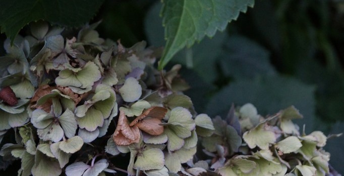
Fragile Memories

Because I remembered Arthur Huang’s Memory Walks from Art Byte’s show at Hagiso, I popped by the opening and took a few pictures. The photos were gorgeous, and I still love the concept that he had for the drawings on the eggs. (I do not know how he stores them so they do not get smashed. They are incredibly fragile, right?) I will let Huang explain in his own words what he was doing.
“Tokyo Memory Walks” are drawings on eggshells which represent a walk that I have taken this year – such as going from home to the convenience store, the train station to a museum, or a bus stop to work. These drawings are made one day or more after each walk.
For each drawing, I start at the top of the eggshell and trace the route that I took from memory. In the course of drawing, I also use symbols to indicate markers that I encounter along the walk, such as stairs, elevators, or doors. One string of eggshells represents one day of walks. The eggs are arranged from morning to evening starting from top to bottom.
“Kojimachi Interstices” is a series of 57 composite digital images created while documenting the alleyways between buildings around Kojimachi Collection, Kojimachi Station, and the surrounding Kojimachi area. Alleyways are often overlooked as we go about our daily lives. Each composite image is made up of layers of photographs for all the alleyways in a block. The layers of photographs are digitally manipulated by altering the transparency of each layer to transform these overlooked spaces into something new. For this exhibition, fourteen of the “Kojimachi Interstices” are installed as large format inkjet prints representing different parts of the Kojimachi area. The entire series can be viewed in the “Kojimachi Interstices” portfolio or upon request.
The venue was obviously not the right kind of space to show off the photos but it was part of the neighbourhood that he recorded in these pieces. Community support is good, right?

My snapshot has added a few more layers of images to his photos. The layers are intricate and surprisingly delicate for layers and layers of photos of urban dwellings. He supposedly had a hard time deciding between the matte and the glossy paper, but the glossy was the right decision. It is interesting how people now try to replicate what the see on their computer screens. That might have been one of the original reasons for his choice but I think it helped the photos pop off the walls in that crowded and busy space.

 Friends and other local artists, including Lori Ono, Koubou Deeanna, and Ruriko Clarkson, were there to offer support.


And Huang was there to chat and answer any questions. If you want to try drawing your own walks around Tokyo by memory, he is giving a workshop this weekend on August 23 and 24.
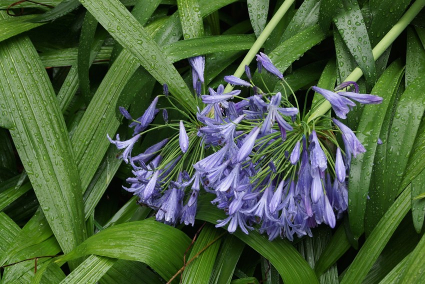
Hydrangea
Artistic Decisions

People often ask me about the choices I make when I draw or work on a different kind of project. Some things are instinctive; some choices are planned. Some are creative challenges decided before starting; some are challenges created by limitations in the environment upon arrival.
“How do you know when it is finished?”
I just know. It tells me.
“How do you decide what colours to use? How do you decided where to use what colour?”
Sometimes it depends on what colours I have brought with me or how I limit myself. I can also see the bright colours that I am using in the subject. I can’t help it; I do see them.
One small choice can have a great impact. For example, colour, saturation, and other factors can change a photograph of the same subject in very subtle ways. I do not use PhotoShop and I do not manipulate my photos much at all. All I did here was use a filter to change the colouring. Which one do you like best?

This was the original photo taken in colour. All of the other photos have been altered by changing the colour.

For some reason unbeknownst to me, lights and shadows appear differently when a camera is set to colour vs black-and-white. When actual negatives were used to print on paper, printing black-and-white photos on paper made for colour copies often gave a pink tone to the finished prints. Subtle changes are seen in digital prints, too. The shadows are not as strong; the greys are more delicate. That could just be my imagination…


This was a colour photo but it looks more like a photo that I could have taken with the b&w setting only after I punched up the shadows with one quick click.

Next are two photos of the dead lotus plants in a pond in Ueno park. Both photos show the same subject from similar angles, but the colour is different. With that one small change, I knew that I wanted the reflection on the water in the black-and-white version and a focus on the lush green leaves in the colour. Almost the same but yet so different.

